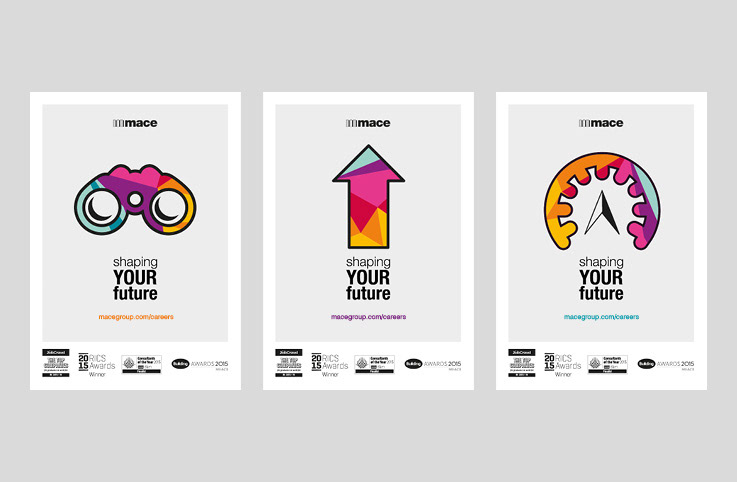
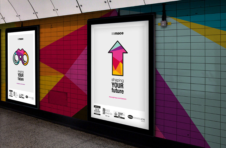
Concept 1
Using brand colours and graphic iconography devices gave this route a strong visual look and was an approach that was not like any of the competitors. This modern and fresh approach was a refreshing alternative to using photography. The conceptual idea was based on an existing strapline, 'Shaping cities, building stories'. The iconography created was relevant to perspectives and direction.
Concept 2
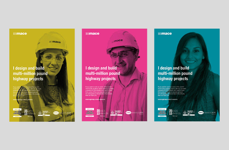
A people focussed approach using photography of real employees to show an honest reflection of diversity in the company. QR codes could feature on printed materials where people are invited to scan and view a video of each person's story. Using statements with different types of people helps to break down the pre-conceptions of stereotypes within the construction industry.
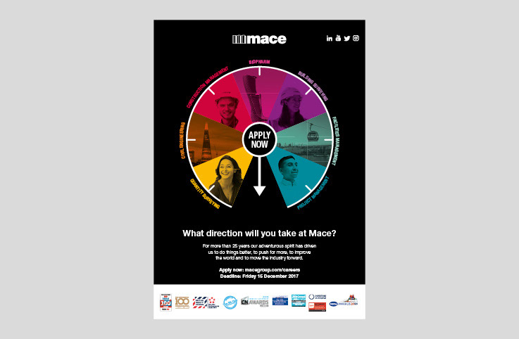
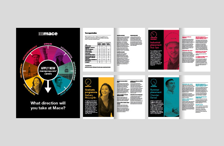
Concept 3 - Final
The final artwork for the graduate campaign took the compass as a navigational device and split into the various sectors and services where there was graduate opportunities. Each person featured told their story on what it was like to work for the company. The compass device and individual stories were re-formatted for use on social media platforms.